Yoni
“How might we foster sorority by bringing women together so that they feel safer when they occupy public space, changing society’s view of harassment against women?”

About the project:
Final project of the UX/UI Bootcamp at Ironhack in November 2019.
My collaboration in this project was mainly as UX Designer in Discovery, definition, ideation and user testing.
Team:
Marina Merlin
Simone Ferreira
Process:
Quantitative Research
Qualitative Reserach
Affinity Diagram
HMW/Problem Statement
Personas
User Journey
Competitive Analysis
Brand Personality
Card Sorting
Site Map
Lo-Fi
Style-Guide
Hi-fi
User Test
Prototype
Quantitative Research

Qualitative Reserach
Learnings from the research:
Mulheres que conhecem seus corpos são mais confiantes e conseguem expressar seus desejos para o parceiro.
Elas se informam através de Youtube e Instragram.
Muitas mulheres não se masturbam por causa de vergonha ou culpa.
Algumas pensam que os homens deveriam saber o que elas gostam no sexo.
Algumas conversam com amigas sobre sexo, mas muitas não se sentem confortáveis com o assunto.
Affinity Diagram
We organized our ideas and data in common themes to analyze and to discover the relationships to allow a design direction based on the associations.
We separated the topics we had into 5 categories:
Sexuality
Chauvinism
Sorority and help
Feminism
Values
From these, we highlighted the keywords to identify what was drawing our attention most to the problem. This led us to a great analysis of the problem.
Problem Statement
Young women need to find a way to get to know themselves and feel safe because they want to express themselves without being judged by society.
We decided that in addition to addressing the issue of sexuality and abuse, we want to help women empower and help each other.
HMW (How Might We)

Personas
We created three personas to help us to understand our users.

User Journey
The journey map was used to help us to identify when users interact with the product. We briefly described a day of our personas to support our design decisions.

Competitive Analysis
From our competitors, we realized that they are not attending everything we want to achieve in our platform.

Brand Personality

Sincero
Amigável
Divertido
Jovem
Independente
Feminina
Tranquilo
Card Sorting e Site Map
From the topics that we did a card sorting with different users to understand how they would organize them. We did that on Figma using “virtual post its”. The first 3 users did an open card sorting. From them, we got the categories name and we asked more 2 users to do a closed card sorting.
We created a site map to organize the navigation of the application.

Low Fidelity
Before the high fidelity we drawn wireframes in low fidelity to test the flow.
Those images are from the mobile version.

High Fidelity and User Test
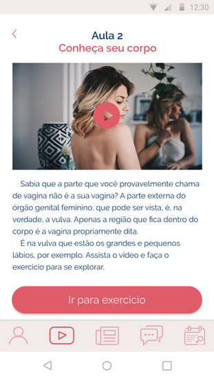
We have asked some users to navigate on our mobile to make sure that the flow was easy and intuitive. We asked them to achieve some actions. We made some corrections for our final version with feedback from first user tests.
Prototipes were made on Figma.
Prototype
Mobile Version
Highlight
Our project was chosen as a highlight among the other final projects of the Bootcamp and it was presented in an event for guest.


Comments